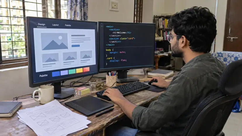
Design markup is the code that turns a static design into a working web page. Brainguru's design markup services convert Figma, Sketch, Adobe XD and Photoshop files into clean, semantic HTML, CSS and JavaScript that is responsive, accessible and consistent across browsers. This page explains what good markup involves, why it matters and how a project runs.
What is design markup?
A designer delivers pictures of pages: layouts, colours, type and spacing. Markup is the step that turns those pictures into code a browser can display and people can use. HTML gives the page its structure and meaning, CSS controls the layout and look, and JavaScript adds behaviour such as menus, tabs and forms.
Two pages can look identical and still be built very differently underneath. Good markup uses the right elements for the job, such as real headings, lists, buttons and form labels, so that browsers, screen readers and search engines all understand the page. Poor markup may look fine in one browser on one screen and fail everywhere else.
Why phones come first
In India, 84.25% of web traffic in October 2026 came from mobile devices, according to Statcounter. Google also uses the mobile version of a site's content, crawled with its smartphone agent, for indexing and ranking. Markup should therefore be designed for small screens first and then expanded for tablets and desktops, not squeezed down afterwards.
Our design markup expertise
Responsive layouts: Fluid grids, flexible images and breakpoints chosen from the design, so pages work on phones, tablets and large screens.
Accurate conversion: Spacing, type, colours and components matched closely to the approved files from Figma, Adobe XD, Sketch or Photoshop.
Semantic HTML: One clear H1, a logical heading order, landmarks, lists and buttons used as intended, which helps both assistive technology and search engines read the page.
Structured data where it fits: We can add schema markup that describes your content. Google says structured data helps it understand a page and can make it eligible for rich results, but its structured data guidelines make clear that correct markup does not ensure it will show up in search results. Our article on schema markup for Indian businesses explains when it is worth adding.
Cross-browser testing: Pages checked in the browsers your visitors use. In India, Statcounter put Chrome at 89.55% of browser share in October 2026, with Safari at 2.66%, so we test Chrome on Android first while still checking Safari, Edge, Firefox and others.
Lightweight code: Small CSS, few scripts, compressed images and no unused libraries, so pages load quickly on mid-range phones and slower networks.
Speed: what Core Web Vitals measure
Google's Core Web Vitals measure how real users experience loading, responsiveness and visual stability. Google's Core Web Vitals documentation sets the targets for a good experience:
| Metric | Good result |
|---|---|
| Largest Contentful Paint (loading) | Within 2.5 seconds |
| Interaction to Next Paint (responsiveness) | Under 200 milliseconds |
| Cumulative Layout Shift (stability) | Less than 0.1 |
Many sites miss these targets. The HTTP Archive Web Almanac 2024 found that 43% of websites had good Core Web Vitals on mobile, against 54% on desktop. Markup has a direct effect: heavy scripts slow responsiveness, and images without set dimensions make layouts jump. Our article on Core Web Vitals for Indian websites goes into the fixes.
Accessibility starts in the markup
Most accessibility barriers are created, or avoided, when a design is turned into code. The WebAIM Million 2026 report, which tests the home pages of one million websites, found detected WCAG 2 failures on 95.9% of them, an average of 56.1 errors per page. Low contrast text was the most common problem, found on 83.9% of home pages.
We build to the current standard. WCAG 2.2 became a W3C Recommendation on 5 October 2023 and added 9 success criteria to WCAG 2.1. In practice, that means proper labels on every form field, visible focus states, meaningful alt text, enough colour contrast, and controls that work with a keyboard. For a full audit, our accessibility testing service checks pages with screen readers and other assistive technology.
Why choose us for markup work?
Review before handover: Every template is checked against the design, validated, and tested on real devices and browsers.
Built to standards: Code follows W3C HTML and CSS specifications and WCAG guidance, which keeps it maintainable and easier to extend.
Fits your stack: Markup can be delivered as static HTML, as components for React, Angular or Vue.js, or as themes for WordPress, Magento and Shopify.
Shaped by your project: Corporate sites, eCommerce stores, SaaS dashboards and landing pages each need different trade-offs, and we plan around yours.
How a markup project runs
- Review the designs: We check files for missing states, such as hover, error and empty, and agree breakpoints.
- Plan components: Repeated elements are built once as reusable components.
- Build: Semantic HTML and CSS, with JavaScript only where it is needed.
- Test: Browsers, devices, keyboard use, screen readers, speed and validation.
- Hand over: Clean, documented code ready for your developers, CMS or back end.
What good markup gives you
- A better user experience: Pages that look as designed and work on every device.
- A sound technical base for search: Clear structure that is easy for search engines to crawl and understand.
- Faster pages: Less code to download and run.
- Consistent branding: The same components and styles everywhere.
- Easier updates: Well-organised code that is quick to change.
Our design conversion services
- PSD To HTML5: responsive, mobile-friendly HTML5 code built from your PSD designs.
- PSD To Bootstrap: mobile-friendly Bootstrap pages built from PSD designs.
- PSD To WordPress: PSD designs converted into working WordPress websites.
- Sketch To HTML: Sketch files turned into responsive HTML websites.
- UI/UX Design: interface and experience design focused on usability across devices.
- PSD To Joomla: PSD designs converted into custom Joomla websites.
- PSD To Drupal: PSD designs turned into Drupal websites.
- PSD To Magento: PSD designs converted into working Magento stores.
- PSD To Shopify: static PSD designs converted into Shopify themes.
- PSD To PrestaShop: PSD designs converted into responsive PrestaShop stores.