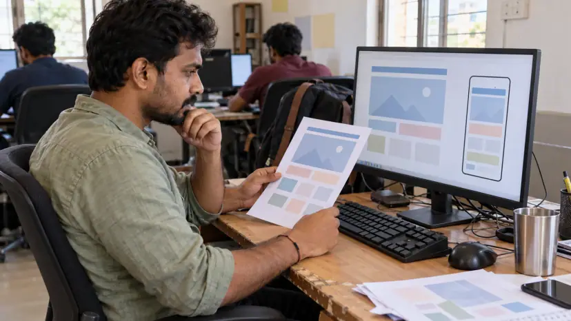
PSD to Bootstrap conversion turns your design into responsive HTML and CSS built on Bootstrap, the open-source front-end framework. Brainguru codes Photoshop, Figma or Sketch layouts by hand on Bootstrap's grid and components, customised to your brand, so the pages adapt cleanly to phones, tablets and desktops and are ready for any back end.
What Bootstrap is and why teams use it
Bootstrap is a library of CSS and JavaScript for layout and common interface parts: a responsive grid, navigation bars, buttons, forms, modals, dropdowns and more. Instead of writing every piece from scratch, developers build on parts that have already been tested across browsers.
It remains one of the most widely used front-end tools. W3Techs reported on 5 November 2026 that Bootstrap is used on 14.5% of all websites, or 19.3% of sites whose JavaScript library it can identify. Because so many developers know it, a Bootstrap codebase is easy to hand to another team later.
The current version is also lighter to run than older ones. Bootstrap's documentation states that you don't need jQuery in Bootstrap 5, which removes a whole library from each page compared with older builds.
Why choose PSD to Bootstrap conversion?
A Bootstrap build suits projects where the front end must be solid, responsive and easy to extend, but where you do not want a heavy custom framework. Common cases are marketing sites, landing pages, admin dashboards, prototypes that need to become real products, and front ends that a back-end team will later connect to an application.
It is less suitable when a design is deliberately unusual in every component. Then much of Bootstrap would be overridden, and a hand-written front end or our PSD to HTML5 service may be cleaner.
Built mobile first
Bootstrap's own breakpoints guide describes mobile-first responsive design as the goal: styles start at the smallest screen and add rules for larger ones. It includes six default breakpoints, sometimes called grid tiers, and they can be changed in the Sass source when a design needs different widths.
This matches how people browse. In India, phones produced 84.21% of web page views in October 2026, against 15.17% for desktops, according to StatCounter. Google also uses the mobile version of a page for indexing and ranking, as its mobile-first indexing guidance explains. So we review the mobile layout first, and where a design only shows desktop, our mobile website design team can fill the gaps.
Our PSD to Bootstrap conversion process
- Design review: We map the layouts to the grid, list the components, and note missing states such as open menus, form errors and long text.
- Theme set-up: Colours, type, spacing and breakpoints are set as Bootstrap Sass variables, so the brand lives in one place.
- Hand-coded markup: Pages are written in semantic HTML5 using the grid and components, with custom CSS only where the design needs it.
- Only what you use: Unused Bootstrap components are left out of the build to keep files small.
- Testing: Pages are checked across current browsers, real phone sizes, keyboard use and validation.
- Handover or integration: You receive clean files, or we connect the front end to WordPress, another CMS or your application.
Accessibility in a Bootstrap build
Bootstrap's components come with accessibility features, but they only work when used correctly. The WebAIM Million 2026 study found home pages using Bootstrap averaged 63.3 detected errors, 12.8% above the average, although WebAIM notes the cause cannot always be pinned on the technology. The most common error across all pages was low-contrast text, found on 83.9% of home pages.
Brand colours often fail contrast once they are applied to Bootstrap's buttons and alerts, so we check every colour pair. We also keep the built-in labels, focus styles and ARIA attributes in place. Our accessibility testing service covers a full WCAG audit.
Benefits of a well-built Bootstrap front end
- Consistent components: Buttons, forms and cards look and behave the same on every page.
- Faster changes: New pages are assembled from existing parts rather than designed from scratch.
- Cross-browser support: Bootstrap publishes the browsers and devices it supports, which makes testing predictable.
- Easy handover: A widely known framework makes the code easier for another developer to maintain.
- Search-ready structure: Semantic headings, fast pages and readable markup give search engines a good base.
What affects the cost of a Bootstrap project?
- Unique layouts: The number of page designs that are not variations of each other.
- Custom components: Parts that Bootstrap does not provide, such as complex sliders or data tables.
- Interactions: Animations, multi-step forms and dynamic filters.
- Missing designs: Mobile or tablet layouts that need to be worked out during the build.
- Integration: Whether you need static files or a front end connected to a CMS or application.
Instead of a price list, we give a written estimate once we have seen your designs in a free consultation. If the design itself needs work first, our UI/UX design team can help.
Questions to ask before you hire
- Customisation: Will brand colours and spacing be set as Sass variables, or overridden with extra CSS on top of Bootstrap?
- File size: Will unused components be removed from the final build?
- Devices: Which phone and tablet sizes will be tested, and on which browsers?
- Accessibility: How will contrast, keyboard use and screen reader labels be checked?
- Handover: Will you receive the source Sass and build steps, not only compiled files?