In this article
- Key takeaways
- What the Google Mobile-Friendly Update Changed
- How Google Decided a Page Was Mobile-Friendly
- Questions Google Answered in 2015
- 2016: A Stronger Signal and Mobile-First Indexing
- Testing Tools Then and Now
- Page Experience and Core Web Vitals
- A Mobile Checklist for Business Websites
- Conclusion
- Frequently Asked Questions
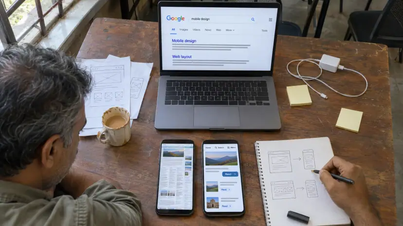
The Google mobile-friendly update was a ranking change that Google began rolling out on 21 April 2015. It gave pages that work well on phones a boost in mobile search results. This guide explains what the update did, how Google judged a page, what has changed since, and how to check a site today.
Editor's note: this article was first published on 22 April 2015, the day after the rollout began. The history below is kept as it happened. The sections on testing, mobile-first indexing and page experience are based on Google's current documentation and were updated in 2026.
What the Google Mobile-Friendly Update Changed
Google gave site owners about two months' notice. On 26 February 2015 it announced that, starting 21 April, it would expand its use of mobile-friendliness as a ranking signal, and said the change would affect mobile searches in all languages worldwide.
When the rollout began, Google's announcement of 21 April 2015 set out three limits on what the update touched:
- It affected rankings on mobile devices only.
- It applied to search results in every language, everywhere.
- It worked page by page, not on whole websites.
The same post warned that sites whose pages were not mobile-friendly could see a significant fall in mobile traffic from Google Search. It also made clear that the boost was one signal among many. A page that answered the query well could still rank, even if it was hard to use on a phone.
For a business owner in 2015, the message was simple. If customers searched on their phones and your page made them pinch and zoom, a competitor with a phone-ready page now had an edge in those results.

How Google Decided a Page Was Mobile-Friendly
Google described a mobile-friendly page in plain, practical terms. The text could be read without tapping or zooming. Links and buttons were spaced so a finger could hit the right one. The page avoided content that phones could not play, such as old Flash video, and it did not force the visitor to scroll sideways.
Google's FAQ on the update, published the same day, added some detail that is still useful when you brief a designer:
- Tap targets: Google suggested at least 7mm width and height for primary tap targets, with at least 5mm between secondary ones, noting that an adult's finger pad averages about 10mm.
- Site setup: responsive design, separate mobile URLs and dynamic serving were assessed the same way. A site did not have to be responsive to count as mobile-friendly.
- Video embeds: old-style object embeds caused errors. Google advised iframe embeds, which use the phone's own video support.
- Stripped-down mobile sites: Google warned that a bare temporary mobile version could frustrate visitors if it stopped them finishing common tasks.
Questions Google Answered in 2015
The same page also answered the questions site owners were asking in the first days of the rollout. Most of these answers explain how Google treats mobile pages to this day.
- Desktop and tablet: the update had no effect on searches from tablets or desktops.
- Page level: if ten pages on a site were mobile-friendly and the rest were not, only those ten could gain.
- No waiting for a refresh: Google checked mobile-friendliness each time it crawled and indexed a page, so a fixed page could count once it was crawled again.
- Rollout time: Google said it would take a week or so for the update to reach all pages in its index, so a quiet day on 22 April proved nothing either way.
- Outbound links: linking to a page built for large screens did not change the status of your own page.
- Large sites: Google suggested submitting a sitemap, with the lastmod tag where mobile content used existing URLs, to speed up reprocessing.
The most common problem Google described was a page that looked fine on a phone but still failed Google's test. Usually Googlebot for smartphones was blocked from the CSS and JavaScript files that control the layout, so Google could not see the page as a visitor would. The fix was to let Googlebot crawl those files and ask for the page to be processed again. That advice still holds: never block the files your layout depends on in robots.txt.
2016: A Stronger Signal and Mobile-First Indexing
The update was a starting point, not the end of the story. On 16 March 2016 Google said that from May it would increase the effect of the mobile-friendly ranking signal. Sites that were already mobile-friendly would not be affected. Google repeated that the intent of the query remained a very strong signal.
The bigger change came later that year. On 4 November 2016 Google announced that it had begun experiments to make its index mobile-first. Until then, its systems mostly looked at the desktop version of a page, even for people searching on phones. Under mobile-first indexing, Google would mainly use the mobile version of a site's content to rank pages and show snippets.
That move took years. On 31 October 2023 Google said that the move to mobile-first indexing was complete, and that a mobile page now needed to be as complete as its desktop version. The few sites still failing on mobile, Google said, mostly showed errors to all mobile users, blocked the mobile version in robots.txt, or redirected every mobile page to the home page.
So the question has changed. In 2015 it was whether your page earned a boost on phones. Today Google reads the mobile version first, so content missing from your mobile pages may not count at all.
Testing Tools Then and Now
In 2015 the usual checks were Google's Mobile-Friendly Test for single pages and the Mobile Usability report in Webmaster Tools, now called Search Console. Both have gone. In a post of 19 April 2023, Google said that from 1 December 2023 it would retire the Mobile Usability report, the Mobile-Friendly Test tool and its API. It added that mobile usability still matters and pointed to Lighthouse from Chrome as one of the tools that had taken their place.
A practical testing routine today looks like this:
- Run Lighthouse in Chrome's developer tools on your key pages: the home page, top service or product pages and the contact page.
- Use URL Inspection in Search Console to see how Googlebot renders a page and to request indexing after a fix. It replaced the old Fetch as Google tool.
- Check the Core Web Vitals report in Search Console, which uses real visitor data rather than a lab test.
- Test on real phones, including an older, low-cost Android handset on a mobile connection. Many of your customers will use one.
For a step-by-step walk through these checks, see our guide to testing and improving website speed and mobile-friendliness.
Page Experience and Core Web Vitals
Mobile-friendliness now sits inside Google's wider idea of page experience. Google's guide to page experience in Search results asks whether content displays well on mobile devices, alongside questions about Core Web Vitals, secure HTTPS pages, intrusive interstitials and heavy ads. Google says there is no single page experience signal, and that its core ranking systems look at a variety of signals.
Core Web Vitals are the measurable part. Google's Core Web Vitals documentation sets these targets for a good user experience:
- Largest Contentful Paint (LCP): loading, within the first 2.5 seconds.
- Interaction to Next Paint (INP): responsiveness, under 200 milliseconds.
- Cumulative Layout Shift (CLS): visual stability, a score under 0.1.
INP replaced First Input Delay on 12 March 2024. Google is also clear that good scores do not promise top rankings. Relevance still comes first, and page experience helps most where many pages answer a query equally well. Our article on Core Web Vitals for Indian websites covers what to fix first.
A Mobile Checklist for Business Websites
Most of the 2015 advice still applies, with a few additions. Work through these points for your main pages:
- Text reads comfortably on a small screen without zooming.
- Buttons, phone numbers and menu links are large and well spaced.
- Nothing scrolls sideways, including tables and wide images.
- No pop-up covers the main content as soon as the page opens.
- The mobile page carries the same content, headings, images and structured data as the desktop page.
- CSS, JavaScript and image files are open to Googlebot in robots.txt.
- Images are compressed and sized for phones, so pages load quickly on mobile data.
- Forms are short and use the right keyboard, such as a number pad for phone fields.
If your site fails several of these, a redesign may cost less than patching an old theme page by page. Our piece on why your brand needs a modern, mobile-friendly website explains what to look for.
Conclusion
The Google mobile-friendly update of April 2015 was the first clear sign that Google would judge pages by how they work on a phone. It started small: a page-level boost in mobile results only. It was strengthened in 2016 and followed by mobile-first indexing, which Google completed in 2023. The testing tools of 2015 have been retired, but the aim is the same. Build pages that are easy to read, tap and load on a phone, and keep the mobile version complete.
Frequently Asked Questions
When did the Google mobile-friendly update roll out?
Google announced it on 26 February 2015 and began rolling it out globally on 21 April 2015. Google said it would take a week or so to reach every page in its index. In March 2016 Google said it would strengthen the signal from May that year, and mobile-friendliness remains part of its page experience guidance.
Did the update affect desktop or tablet rankings?
No. Google said the update had no effect on searches from tablets or desktops. It changed rankings only for searches made on mobile phones, in all languages and locations. Since then, mobile-first indexing means Google mainly uses the mobile version of a page for indexing and ranking, whatever device the searcher uses.
Was the mobile-friendly boost page-level or site-level?
It worked page by page. Google gave the example of a site with ten mobile-friendly pages and many that were not: only those ten pages could gain. Google checked each page whenever it crawled and indexed it, so a page fixed after the rollout could count without waiting for another update.
Can a page rank on mobile if it is not mobile-friendly?
Yes. Google said the intent of the search query remained a very strong signal, so a page with great content for a query could still rank well without being mobile-friendly. Being hard to use on a phone is a disadvantage, not a ban, but it costs you where competing pages answer the query equally well.
How do I check whether my site is mobile-friendly today?
Google retired its Mobile-Friendly Test and the Mobile Usability report on 1 December 2023. Use Lighthouse in Chrome for page checks, URL Inspection in Search Console to see how Googlebot renders a page, and the Core Web Vitals report for real visitor data. Then test on a real, low-cost phone.
Read next
Mobile-Friendly SEO: How to Rank on Mobile-First Search
Google ranks your site through its mobile pages, so keep content the same on every device, test on a real phone and fix speed before anything else.
Read article
SEO Rank Tracking APIs in 2026: Options, Costs and Google's Rules
Search Console's free API, paid SERP APIs and Google's rules on automated queries: what each costs and when to use which.
Read article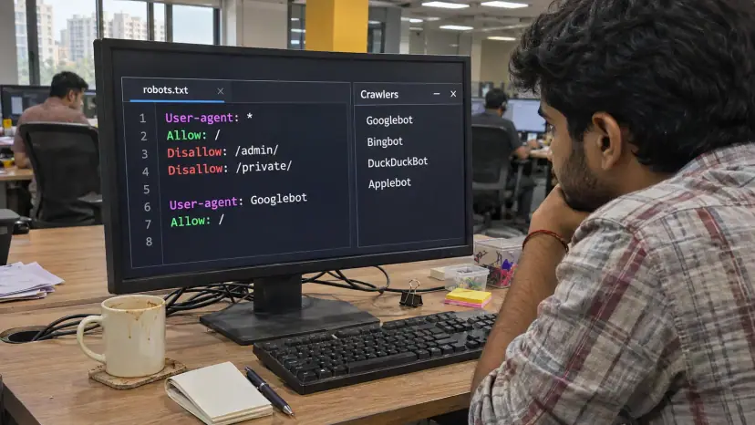
robots.txt for AI Crawlers: What to Allow and Block (2026)
Blocking GPTBot does not remove you from ChatGPT search. See what each AI crawler does and which policy fits you.
Read article
Comments
Be the first to share your thoughts on this article.